 Call 07 3257 2226
 Call 07 3257 2226
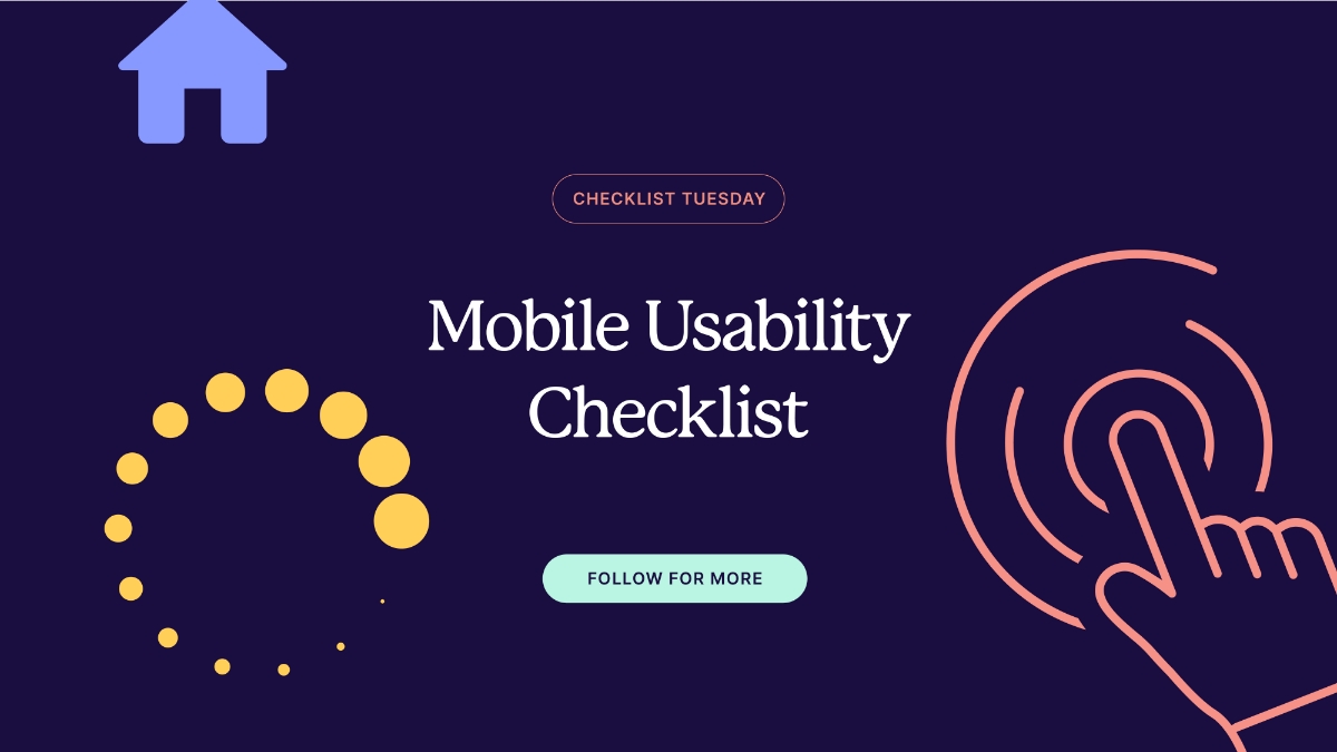


Did you know that mobile devices account for over half of global web traffic? With the increasing number of users accessing websites on smartphones, it’s crucial that you don’t overlook mobile usability when designing and developing your website.
Designing for mobile is inherently more interactive and tactile compared to desktop environments. This checklist covers all the essentials and provides actionable tips for optimising your page layouts, ensuring ease of navigation, user-centric functionality and improving the overall mobile user experience. Make a habit of reviewing this checklist regularly and updating your website as mobile usability standards evolve.
Download the Free Checklist Now
Consider this checklist your strategic partner, laying the foundation for a more accessible and effective mobile experience for your users.