


Without effective Call to Actions (CTAs), all the time and resources invested in building your website and cultivating your brand may go to waste. While engagement is extremely important, it’s the CTA that ultimately bridges the gap between passive interest and active conversion. If you want to drive clicks, increase sales, and elevate your digital strategy, prioritising your CTAs is non-negotiable.
What is a Call to Action (CTA)?
A Call to Action or CTA is a prompt that encourages users to take a specific action. Whether it’s getting users to fill out a form, or make a purchase, CTAs guide users toward the next step in their journey. Effective CTAs are clear, persuasive, and strategically placed to maximise conversions.
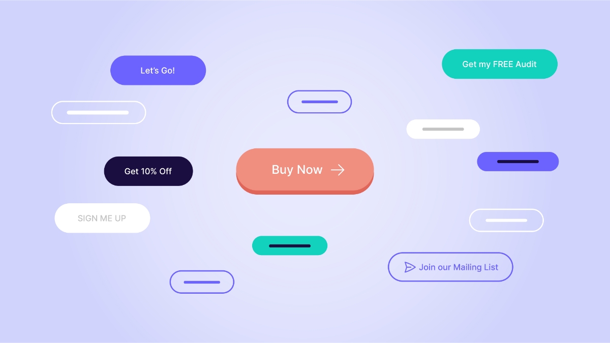
Examples of High-Impact CTAs:
- eCommerce: “Add to Cart” or “Shop Now,” paired with urgency-oriented messaging like “Limited Stock Available.”
- Service-Based Businesses: “Get a Free Quote” or “Book a Consultation” to spark enquiries
- Lead Generation: “Download Our Free Guide” or “Subscribe to Our Newsletter,” which drive list-building and customer engagement.
How to Craft CTAs That Convert
1. Use Action-Oriented Language
Strong verbs like “Get,” “Start,” “Try,” and “Discover” encourage users to take immediate action. Studies show that CTAs using urgent and direct wording can boost conversion rates by as much as 32% (Source: WordStream).
Example: Instead of a generic “Learn More,” try “Get Your Free Trial Today.”
2. Make CTAs Stand Out Visually
A CTA should not only be compelling in content but also in design. It must stand out on the page to guide users towards the next step. Strong contrast, proper spacing, and font clarity are key.
- Visual Strategy: Contrast your CTA button with the background, using a colour palette that remains aligned with your brand. A high-contrast button can improve visibility and increase conversions by as much as 21% (Source: HubSpot).
- Design Tip: Large buttons, coupled with strategic typography, can increase readability and decrease friction for users. A solid, high-contrast “Buy Now” button can signal urgency, while an outlined button for secondary actions, such as “Explore The Range,” helps maintain visual hierarchy.
3. Keep CTAs Short and Sweet
A concise CTA is more effective than a long-winded one. Users should instantly understand what action is expected. According to a study by Unbounce, CTAs with fewer than five words perform significantly better than longer alternatives.
Example: Instead of “Click Here to Subscribe for Our Weekly Email Newsletter,” try “Subscribe Now.”
4. Optimise for Mobile Users
With mobile usage accounting for over 50% of web traffic in Australia, ensuring CTAs are easily clickable on smaller screens is essential. Buttons should be large enough to tap, with adequate spacing to prevent accidental clicks.
Example: A well-optimised mobile CTA will have clear padding and a thumb-friendly size of at least 48 pixels (Google UX guidelines).
5. Test and Refine
A/B testing different CTAs helps identify which wording, colour, or placement generates the best response.
Example: Testing “Get 10% Off” vs. “Claim Your Discount” can reveal which performs better. According to Optimizely, A/B testing CTAs can increase conversions by up to 30%.
Risks for Underestimating Your Call to Actions
A weak or missing CTA can negatively impact user engagement, conversions, and overall business success. Here’s what can happen when CTAs are ineffective:
Lower Conversions = Lower Profits
If users are unsure about what to do next, they’re less likely to convert. A poorly designed CTA—whether vague, hidden, or unappealing—means lost revenue opportunities.
Example: A generic “Click Here” button doesn’t communicate value, whereas “Get 10% Off Today” clearly incentivises action.
Confused Users = Low Engagement
When visitors don’t know what action to take, engagement drops. Without a clear CTA, users may navigate aimlessly or abandon your site altogether.
Example: If a landing page lacks a visible CTA, potential customers may leave without signing up or making a purchase.
Poor Click-Through Rates (CTR)
An ineffective CTA can significantly lower CTRs in ads, emails, and landing pages. Users are more likely to engage when a CTA is compelling, visually distinct, and action-oriented.
Example: “Learn More” is a very generic term and far less engaging than “How It Works”.
Conclusion
Your CTA is the gateway to conversions—and its importance cannot be overstated. While it may seem like a minor detail, the numbers tell a different story. Major brands invest significant resources perfecting every element of their digital strategy, and CTAs are no exception. Whether you’re driving product sales, capturing leads, or boosting engagement, a well-crafted CTA is a decisive factor in driving results. By strategically designing CTAs that are both compelling and visually distinctive, you can unlock your website’s full potential and deliver measurable, high-impact outcomes.
Ready to optimise your site for success?
If your website isn’t performing as well as you’d like, it may be time to reassess your approach. At Greenhat, we specialise in auditing eCommerce sites and transforming them into high-converting digital experiences. Contact us today to discuss how we can help you turn your website into a sales powerhouse.